

2019
OpenTable discovery platform
OpenTable is known for its transactional experiences with its diners. Thirty-six percent of our users book a reservation from autocomplete, which means they already know which restaurant they want to go to. We wanted diners to use the app as a discovery platform without impacting our current transactional experience.
Team : Lead Product designer, Product Manager, Copywriter, 2 developers, 2 QA analysts, Data scientist
Stakeholders : Director of product, Engineer Director
Timeline : 2 months years to complete
Contributed : Strategy, research, designs, cop

Problem
Our long-term goal was to provide diners a way to seamlessly walk into a restaurant and walk out without ever pulling out their wallet. Our immediate goal was to develop a new post-booking experience that would make OpenTable's dining experience unlike any other.
kickoff
As a team (product manager, copywriter, iOS + Android developer, researcher), we got together to discuss experiments and designs we had previously explored, their successes and failures, where we wanted to go next, and why
Strategy
This problem can be solved throughout multiple areas in the app. So we needed to strategize where we would start. We decided on the search page due to it having a high impact with 20% of our bookings. After that, I went through all of our previous research to synthesize new concepts we could potentially work on. From there, we prioritized them based on development effort and impact.

Key research insights
Previous research insights from studies about decision factors for different dining occasions, and thought processes behind how diners decide where to eat.
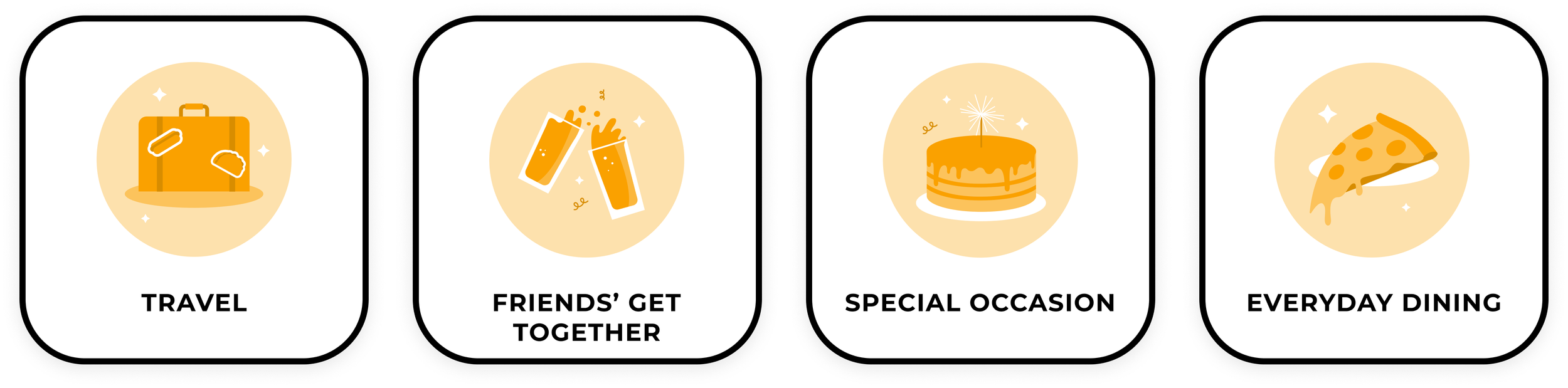
Priorities and criteria: it all starts with an occasion and from there it differs for each person depending on how they feel, what time of day it is, and what they have already eaten that day.
Recommendations: friends and family are considered the most trust worthy. Diners do not like when apps tell them they know them better than themselves. Diners do not want to see the same recommendations over and over again.
Decision paralysis: diners do not want the UI to give them decision paralysis.
Pushing an agenda: diners don’t want the to feel as though Open Table is pushing their own agenda

Brainstorm
I invited designers, product managers, developers, design managers and copywriters to a brainstorm session where the goal was to match an experience with a component and then come up with a concept.
The first round, everyone came up with a new concept and presented it. The second round, we took our remaining cards and built off the existing concepts, taking them further. And finally, we dot voted on which concepts were the strongest.

Categories
Dishes
Matchmaker
Restaurants
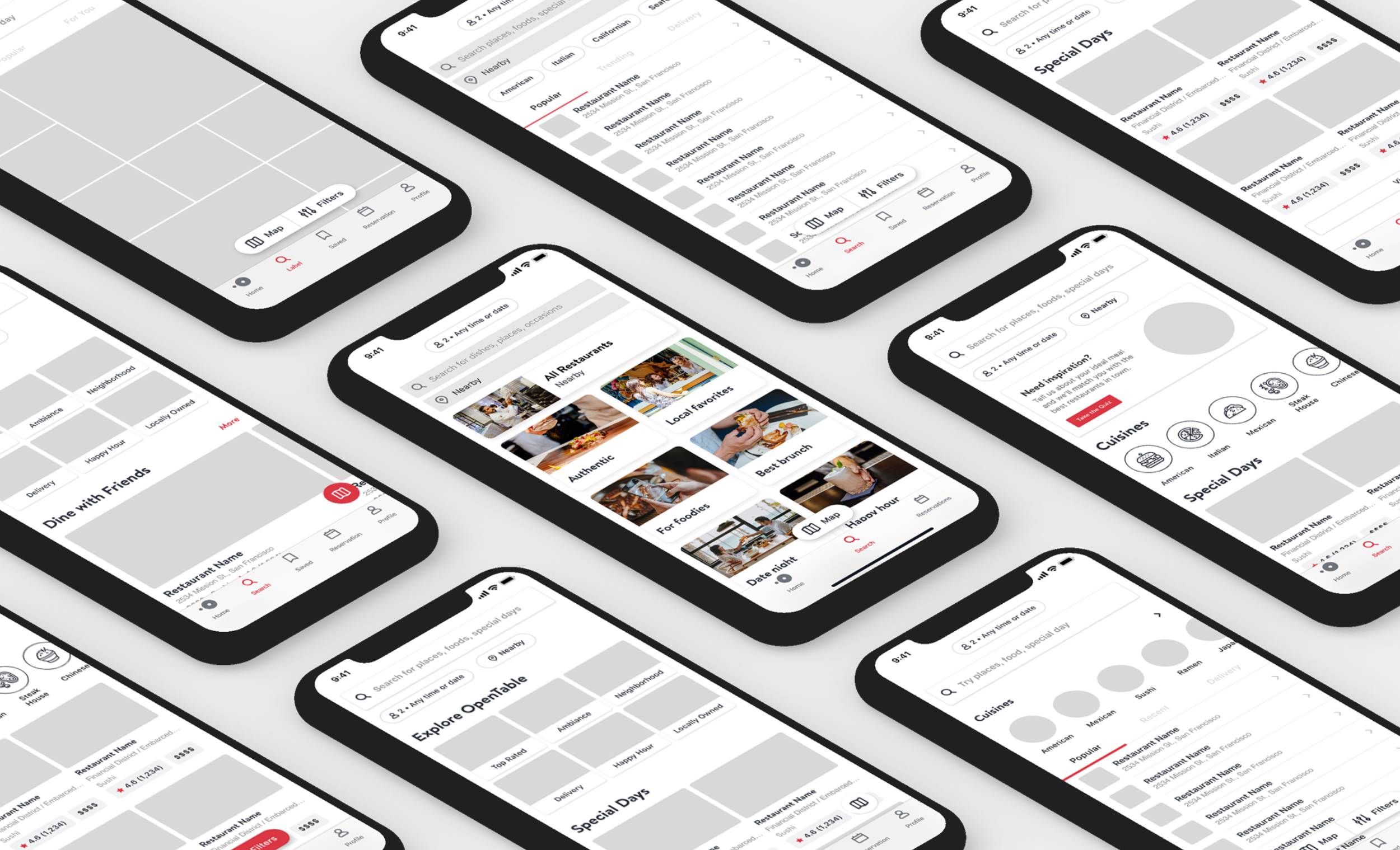
Wireframes
After concepting with the team I was able to quickly put together some wireframes to represent the concepts we came up with. When I was putting together the wireframes, I was able to think 🤔 💭 through some assumptions I had about our diners.
Assumptions
Discovery UI components: we think diners will want larger imagery and different UI components when in discovery mode vs transactional mode.
Date and time picker: we think our DTP should be set to any time or date for discovery.
Transactional experience: we do not want to make any changes to our transactional search experience.

Evaluative research
After finishing wireframes and gathering cross-team feedback, I refined the designs to prepare for testing with our researcher, PM, and user testing lead.
In testing, diners responded positively to browsing by category, noting it made the experience more shareable. However, the “Popular Searches” section was unclear, with users interpreting it in different ways.
The date and time picker, alongside location, was consistently the first element users interacted with.
Lifestyle imagery was preferred over studio shots, as it felt more professional and helped users better understand the categories.
Larger images and a side-by-side layout made it easier for users to get a sense of each restaurant’s atmosphere while reducing scrolling.
On the categories page, diners wanted more clarity on what defines each label—for example, what makes a restaurant good for birthdays.

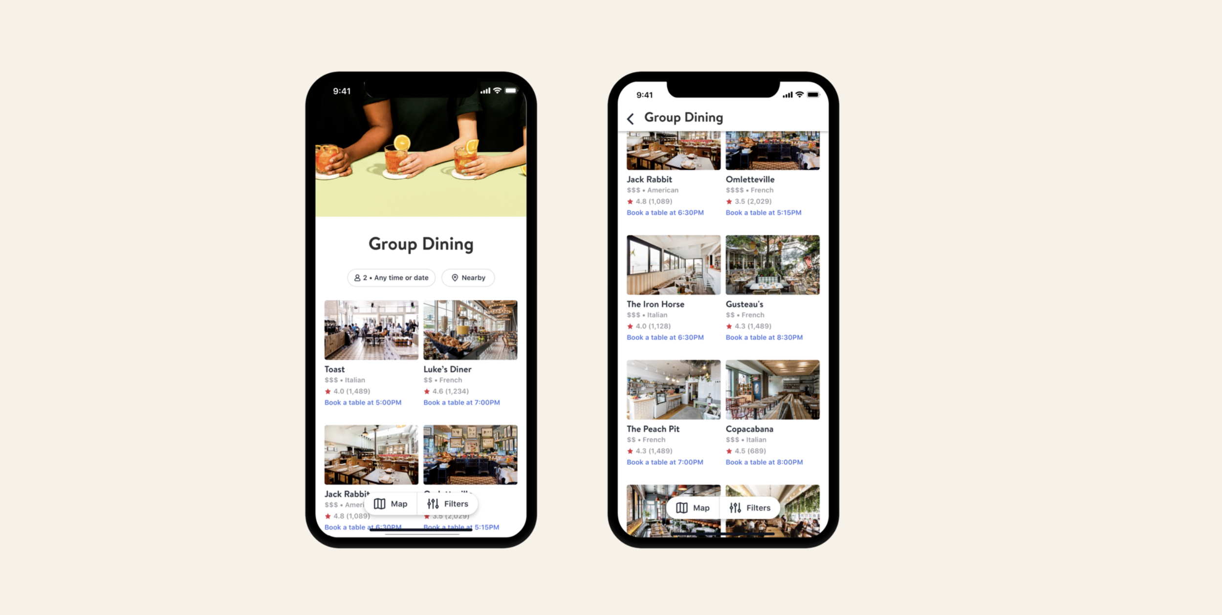
Design decisions
The search start screen allows diners to share what they’re looking for, then surfaces restaurants based on their input. Categories are shaped by the most-used filters in OpenTable’s top five metro areas and common search terms, serving as quick-start filters to guide diners in a focused but flexible direction. These categories are dynamic, adjusting based on location and time of day.
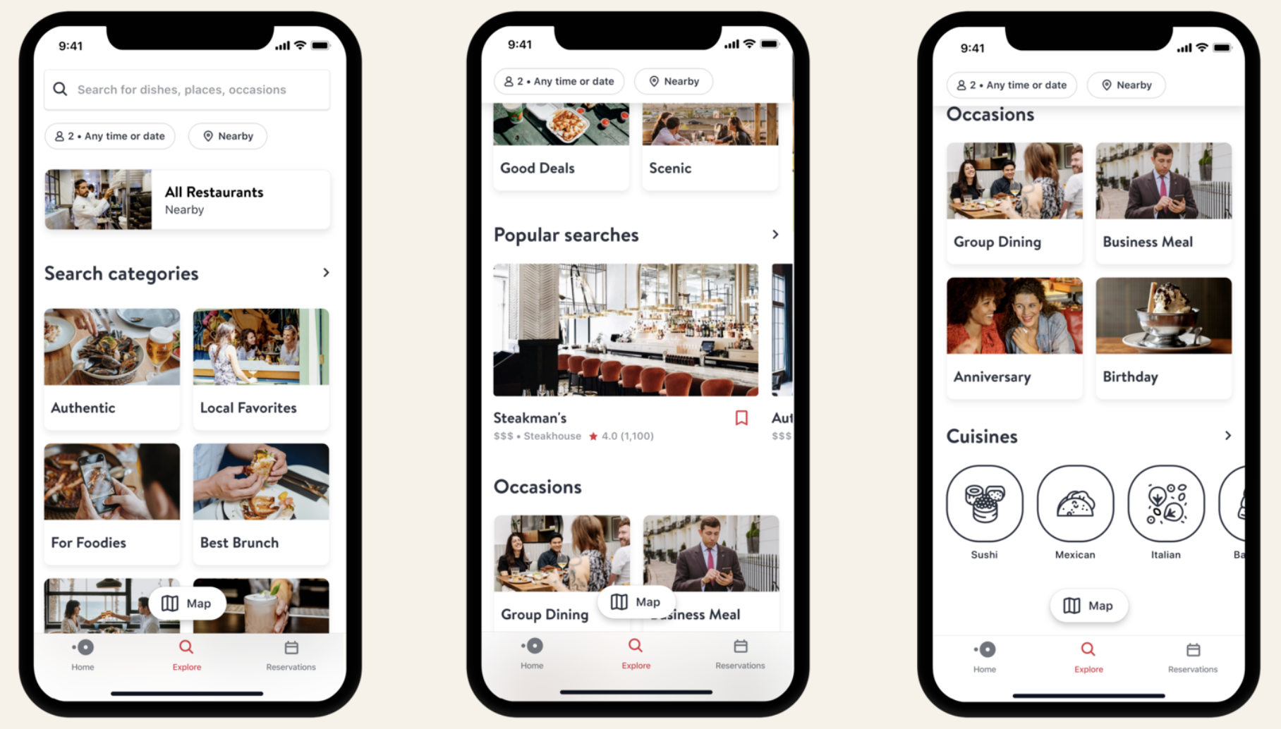
On the categories screen, we added neighborhood information to help diners better understand each restaurant’s location and distance. To avoid the impression that time slots were already booked, we removed them from the discovery view and instead showed the first available time or indicated when no reservations were available.
insights
The restaurants come back from the server in no particular order so we are setting a pre-set filter to be sorted by rating. This is due to how diners thought the restaurants should be sorted in testing.
We removed popular searches and cuisines from the MVP in order to test the categories performance first.
We needed to update the headers to accommodate our new filter redesign.
Even though we have categories already the data scientist team is working on improvements to them in Q4.
Metrics
Increase of discovery bookings from 48% to 53% per week
decrease in transactional bookings from 36% to 28% per week
still an overall decrease in revenue but good enough to start rolling out our new pricing models in other cities